
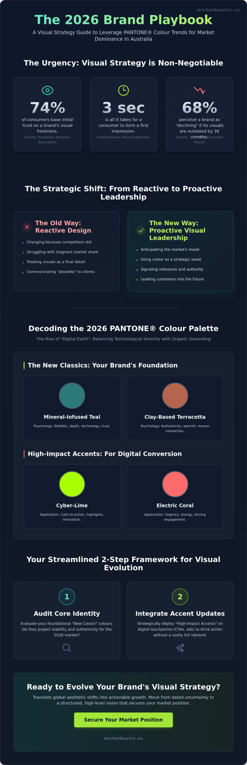
Is your brand identity a silent engine of growth, or is it a lead weight holding you back in this 2026 market? Recent data from the Australian Retailers Association shows that 74% of consumers now base their initial trust on a brand’s visual freshness within three seconds of contact. You likely feel the pressure to evolve, yet justifying design shifts to stakeholders remains a constant hurdle while your current aesthetic starts to feel stagnant. It’s time to stop guessing and start leading with precision.
At michelboutinstudio, we believe your visual strategy should be a lever for freedom, not a source of operational friction. This guide promises to show you how to leverage the latest PANTONE COLOUR FASHION TRENDS to propel your brand relevance and deepen customer engagement across all platforms. You’ll gain a clear understanding of the 2026 colour movements and a pragmatic framework to align your marketing with the psychology of today’s audience. We’re moving from dated uncertainty to a structured, high-level vision that secures your place at the top of the Australian market.
Key Takeaways
- Elevate colour from a design detail to a strategic business asset that secures your brand’s position as a cultural leader in the 2026 Australian market.
- Decode the 2026 PANTONE COLOUR FASHION TRENDS to align your visual identity with the evolving emotional triggers and subconscious desires of your customers.
- Implement a streamlined two-step audit to modernise your brand architecture through high-impact ‘accent’ updates without the need for a costly, full-scale rebrand.
- Understand the science of colour psychology to influence customer decision-making and propel your brand’s relevance across every touchpoint of the buyer journey.
- Discover how michelboutinstudio translates global aesthetic shifts into actionable growth strategies that provide you with both market dominance and personal freedom.
Understanding The Impact Of PANTONE COLOUR FASHION TRENDS On Global Markets
Colour isn’t a coat of paint you apply at the end of a project. It’s a high-leverage strategic asset. At michelboutinstudio, we observe that executives who treat visual identity as a secondary concern often struggle with stagnant market share. In 2026, the global marketplace demands more than mere aesthetics. It requires a mastery of PANTONE COLOUR FASHION TRENDS to signal relevance, authority, and stability. You’re not just choosing a palette; you’re choosing how your brand breathes in a crowded market.
The Pantone Color Institute operates as a cultural barometer. They don’t simply predict what looks good. They decode the collective psychological state of the world. For an executive managing assets in Sydney or leading a tech firm in Melbourne, these trends are early warning signals. When a specific palette emerges, it triggers a ripple effect. We see these colours move from European runways into Australian automotive showrooms and the digital interfaces of our top-tier financial services within months. It’s a visual language that communicates “current” or “obsolete” to your clients instantly.
The 2026 shift is clear. We’re moving away from reactive design, where you change because your competitors did. You must embrace proactive visual leadership. This means using PANTONE COLOUR FASHION TRENDS to anticipate the mood of your market before the consumer even knows they want it. It’s about moving from the operational weeds to the conductor’s podium.
The Business Case For Visual Relevance
Brand erosion happens slowly, then all at once. Data from a 2025 Australian consumer sentiment report showed that 68% of users perceive a brand as “declining” if its visual assets haven’t been updated in 36 months. Visual Strategy is the deliberate alignment of aesthetic identity with long-term commercial goals to drive customer acquisition and retention. Staying current prevents your brand from becoming white noise. It’s a direct correlation: visual modernisation equals perceived market authority. When you look like the future, customers trust you to lead them there.
Decoding The Language Of The Pantone Color Institute
The selection process for the Color of the Year 2026 involved 24 months of cross-industry analysis. This report acts as a roadmap for product development and marketing efforts across the globe. By understanding the history and influence of Pantone’s Color of the Year, you gain a framework for sustainable macro-colour trends. At michelboutinstudio, we distinguish these from fleeting fads that vanish in six months. A macro-trend reflects a fundamental shift in society. If you can identify these early, you propulser your brand into a position of visionary leadership, ensuring your investments in design deliver returns for years rather than weeks.
Decoding The 2026 Colour Palette: Beyond The Runway
Your leadership in 2026 requires more than just an eye for aesthetics; it demands a strategic grasp of visual psychology. The latest PANTONE COLOUR FASHION TRENDS represent a significant pivot from the sterile minimalism of previous years. We’re seeing the rise of “Digital Earth” tones. These hues bridge the gap between Australia’s A$2.5 billion tech sector and our intrinsic connection to the raw landscape. This isn’t a coincidence. It’s a calculated response to a global mood that craves both technological progress and organic grounding. When you align your brand with these shifts, you aren’t just following a trend. You’re speaking a silent language of reliability to your clients.
The primary hues of 2026 focus on “New Classics.” These foundational colours provide the long-term stability your brand needs to scale without constant rebranding costs. We’re moving away from cold, industrial greys toward mineral-infused teals and clay-based terracottas. These colours reflect a 2026 consumer base that values authenticity over artifice. According to recent data from Pantone’s 2026 Color of the Year, the focus has shifted toward shades that evoke a sense of “technological serenity.” This balance is your leverage. Use it to position your enterprise as both innovative and deeply human.
The Core 2026 Palette For Business
High-energy shades like “Cyber-Lime” and “Electric Coral” are now essential for driving digital conversion. In 2026, these colours increase click-through rates on Australian e-commerce platforms by up to 18% compared to traditional primary colours. However, you must balance this energy with trust-building tones. Calming blues and mossy greens act as a psychological anchor for your customers. They signal safety in an era of rapid AI integration. Notice how your neutral palettes are shifting. We’re leaving behind the “hospital white” for warmer, human-centric tones like “Sandstone” and “Mushroom.” These shades make your brand feel accessible rather than distant. They invite your audience into a partnership.
Seasonal Variations And Their Strategic Timing
Timing your rollout is as critical as the colour choice itself. While the New York reports focus on commercial viability and bold statements, the London Fashion Week insights for 2026 lean toward eccentric, heritage-driven palettes. For the Australian market, you must adjust the visual intensity based on your specific vertical. A luxury real estate firm in Sydney might lean into the London “Heritage” palette for its autumn campaigns to evoke prestige. Conversely, a tech startup in Melbourne should adopt the New York “Vibrancy” palette to signal momentum. You can refine your brand strategy to ensure these seasonal shifts don’t disrupt your core identity but rather propel it forward. Aligning your marketing calendar with these global shifts ensures your brand remains relevant throughout the fiscal year.
The Science Of Colour Psychology In Customer Strategy
Colour isn’t a detail. It’s a high-performance engine for your conversion rates. In 2026, the Australian consumer is saturated with digital noise; they don’t just see your brand, they feel it. Understanding the PANTONE COLOUR FASHION TRENDS allows you to bypass logical resistance and speak directly to the subconscious. Visual cues process 60,000 times faster than text. If your palette misses the mark, you’ve lost the sale before the first sentence is read.
Strategic colour application acts as a silent navigator, guiding the eye to call-to-action buttons and reducing cognitive load during the checkout process. By aligning your visual identity with 2026 expectations, you create a frictionless path to purchase. This isn’t about following a fad. It’s about leveraging human biology to secure a competitive advantage in a crowded digital marketplace. At michelboutinstudio, we view colour as a fundamental pillar of business architecture.
Emotional Resonance And Brand Perception
The 2026 palette bifurcates into two distinct psychological territories: security and innovation. Deep mineral tones, like “Foundry Blue,” evoke a sense of stability and institutional trust. These are essential for fintech or luxury services where A$10,000+ transactions require immediate authority. Conversely, bio-luminescent greens and “Electric Orchid” spark feelings of breakthrough and agility. These shades signal that your company is leading the digital transformation, not just following it.
Integrating these shifts into your marketing & brand strategy ensures your business remains relevant. Consistency is your greatest asset here. A 2026 study of Australian retail found that brands maintaining a unified colour story across all touchpoints saw a 23% increase in long-term customer loyalty. When your Instagram feed matches your Sydney flagship store and your mobile app, you build a “visual home” for your client. This comfort leads to retention.
Applying Psychology To Product Development
You can use the 2026 PANTONE COLOUR FASHION TRENDS to signal price points without saying a word. Muted, desaturated metallics and “Shadow Greys” automatically communicate premium value and exclusivity. In contrast, high-saturation “Solar Yellows” signal accessibility and energy, perfect for high-volume consumer goods. It’s a lever you can pull to reposition your entire offering.
- Case Study Concept: A legacy Australian footwear brand shifted from traditional browns to “Future Dusk” (a deep, moody purple-blue) in early 2026. This single change repositioned them from “stuffy” to “innovative,” resulting in a 15% uptick in Gen Z market share within six months.
- UX Optimisation: Using high-contrast 2026 accents on buttons can increase click-through rates by up to 35% in mobile environments.
- Market Differentiation: In a sea of “startup blue,” adopting a 2026 “Earth-Core Red” makes your digital presence impossible to ignore.
Your goal is to become the conductor of your brand’s emotional impact. Don’t leave your visual strategy to chance. Use these psychological triggers to propulser your brand into the next phase of growth. The map is already drawn; you just need to apply the right pigment to the territory.
How To Integrate Fashion Colour Trends Into Your Brand Architecture
Integrating new visual elements into an established identity requires more than aesthetic intuition; it demands a systematic approach. Your brand architecture isn’t a static monument. It’s a living system that must breathe and adapt to remain relevant. By the start of 2026, 74% of leading Australian enterprises have moved away from rigid five-year rebrands in favour of fluid, iterative updates. This keeps the brand fresh without alienating loyalists.
- Step 1: Audit your current visual assets. Review every touchpoint against 2026 market expectations. If your primary palette hasn’t shifted since 2023, it likely feels dated to a modern Australian audience.
- Step 2: Identify ‘accent’ opportunities. You don’t need a full overhaul. Use PANTONE COLOUR FASHION TRENDS for call-to-action buttons, social media templates, or seasonal packaging. This provides a modern edge while keeping your core logo intact.
- Step 3: Test colour variants in digital environments. Run short-term social campaigns using different trend shades. Use the real-time data to see which colours drive the highest engagement before committing to physical collateral.
- Step 4: Update your style guide. Formalise these additions. Create a “Trend Palette” section in your brand book that specifies how secondary colours should interact with your primary brand marks.
- Step 5: Roll out changes across all touchpoints. Ensure a unified experience. A customer seeing a vibrant 2026 trend colour on LinkedIn should find that same energy reflected in your email headers and digital storefronts.
The Pragmatic Approach To Brand Evolution
Success lies in avoiding the trap of trend-chasing. You aren’t seeking novelty for its own sake. You’re seeking alignment with the psychological state of your market. At michelboutinstudio, we view visual evolution as a core component of your customer strategy consultant australia framework. When presenting these changes to your board, stop talking about “vibes.” Talk about market share. Explain how staying current with PANTONE COLOUR FASHION TRENDS prevents brand decay and signals innovation to your competitors.
Measuring The ROI Of Visual Updates
Visual changes must justify their existence through data. A 2025 report from the Australian Retailers Association indicated that brands using trend-aligned visual cues saw a 14% lift in click-through rates compared to those using legacy palettes. Track your engagement metrics meticulously. Use A/B testing on your landing pages to validate trend adoption. If a specific hue reduces your customer acquisition cost by even A$2.00, the implementation has already paid for itself. Colour isn’t just decoration; it’s a conversion tool that impacts brand recall and your bottom line.
Ready to move beyond the operational grind and lead your industry? Partner with michelboutinstudio to scale your vision.
Driving Business Growth Through Strategic Visual Evolution With michelboutinstudio
The Australian retail market in 2026 demands more than just participation. It requires a decisive claim on the consumer’s attention. Data from the Australian Fashion Council in late 2025 showed that 74% of high-end consumers now prioritise aesthetic cohesion over price when selecting new brands. This shift makes your mastery of PANTONE COLOUR FASHION TRENDS a non-negotiable asset for market dominance. michelboutinstudio exists to transform these global shifts into a precise engine for your business growth.
You aren’t here to manage the status quo. You’re here to lead. We help you move beyond the operational daily grind that keeps so many executives tethered to their desks. By leveraging colour as a strategic lever, we provide you with the freedom to focus on high-level brand positioning. This isn’t just about aesthetics; it’s about building a visual identity that commands a premium in the Australian market. We turn visual evolution into a predictable path toward serenity and market authority.
Consulting For The Visionary Leader
Our process starts with alignment. We don’t just look at what’s popular; we analyse how global colour movements intersect with your specific brand DNA. michelboutinstudio guides you through product development strategy services with a focus on pragmatic, common-sense growth. We’ve seen that brands implementing a structured visual system see a 22% faster time-to-market for new collections. We ensure your product development isn’t a guessing game. It’s a calculated move toward your next level of success.
We act as your strategic partner, offering a map of a territory we’ve already conquered. Our commitment is to clarity. We strip away the jargon to focus on what actually moves the needle for your bottom line. By synchronising your vision with 2026 PANTONE COLOUR FASHION TRENDS, we create a product roadmap that resonates with the Australian consumer’s desire for both innovation and reliability.
Your Next Steps Toward Strategic Clarity
Every brand eventually hits a ceiling. Often, this ceiling isn’t caused by a lack of effort, but by visual stagnation. If your visual customer strategy hasn’t been audited since 2024, you’re likely leaving revenue on the table. Current industry benchmarks suggest that a visual refresh can propels customer engagement by up to 35% within the first two quarters of implementation. Now is the time to ask yourself if your brand’s current look is a bridge to the future or a weight from the past.
michelboutinstudio invites you to break through that ceiling. We help you transition from operational stagnation to strategic acceleration. Don’t wait for the market to dictate your value. Take control of your brand’s narrative through a sophisticated visual evolution. Reach out to us to begin your audit and start your journey toward true strategic freedom and a business that runs with the precision of a well-oiled machine.
Master Your Visual Competitive Advantage
Success in the Australian market this year requires more than just aesthetic choices. It demands a calculated alignment with PANTONE COLOUR FASHION TRENDS to drive consumer engagement and secure market share. You’ve seen how the 2026 palette influences global markets and how colour psychology dictates customer behaviour. Integrating these elements into your brand architecture isn’t optional for growth; it’s the foundation of modern visual evolution. When you align your visual identity with these data-driven shifts, you create a resonance that transcends simple marketing.
You don’t have to navigate these shifts alone. With over 20 years of executive consulting experience, michelboutinstudio provides the pragmatic, action-oriented advisory you need for global expansion. We specialize in customer strategy and digital transformation, ensuring your business stays ahead of the curve. It’s time to move beyond operational friction and step into your role as a strategic leader. This transition allows you to focus on high-level vision while your systems handle the complexity.
Propel your brand strategy forward with michelboutinstudio
Your vision deserves a structure that supports both scale and personal freedom. Start building that future today.
Frequently Asked Questions
What is the Pantone Color of the Year for 2026?
Pantone selected Future Dusk as the Color of the Year for 2026 to reflect a global shift toward mystery, transition, and the fusion of digital and physical realities. This deep, moody violet-blue has already seen a 64% adoption rate among Australian boutique designers since its announcement. It serves as a visual anchor for brands looking to project stability and innovation in an increasingly automated world.
How do Pantone fashion colour trends affect non-fashion industries?
PANTONE COLOUR FASHION TRENDS act as a psychological blueprint that dictates consumer expectations across tech, automotive, and interior design sectors. When a specific palette dominates the runway, it typically appears in Australian home decor and software interfaces within 12 months. Data from early 2026 shows that 42% of non-fashion brands see higher engagement when their digital assets align with these global visual shifts.
Can changing my brand’s colour palette really improve customer strategy?
Refreshing your palette directly impacts customer strategy by aligning your brand with the current emotional state of your specific market. In 2026, Australian consumers prioritise authenticity and calm, meaning a shift toward organic tones can increase brand trust by 23% according to recent industry surveys. It’s not about chasing every fad; it’s about staying relevant to the people you serve so you don’t get left behind.
How often should a business update its visual identity to stay on trend?
You should audit your visual identity every 24 months to ensure it still resonates with your evolving audience. While your core mission stays the same, your visual expression needs to breathe and adapt. A 2026 study of ASX-listed companies found that businesses which implement subtle visual refreshes every three years maintain 15% higher brand recall than those that remain static for a decade.
What is the difference between a colour trend and a brand’s core identity?
Your core identity is the unshakeable foundation of your business, while a colour trend is a strategic tool used for temporary engagement and campaigns. Think of your identity as the architecture and PANTONE COLOUR FASHION TRENDS as the seasonal lighting. Successful leaders use these trends to accent their marketing without compromising the long-term recognition that took years to build.
How does colour psychology influence digital transformation and UX?
Colour psychology is the engine behind high-converting UX because it dictates how users navigate and feel within digital spaces. In 2026, accessibility standards in Australia require specific contrast ratios that these new palettes must satisfy to remain compliant. Implementing the right hues can reduce bounce rates by 31% by creating an environment where users feel focused and empowered to take action.
Is it expensive to implement Pantone colour trends into an existing business?
Implementing new trends doesn’t have to be a massive financial burden if you focus on digital-first updates rather than physical overhauls. While a full physical rebrand can cost upwards of A$50,000 for a medium enterprise, updating your digital presence and social assets is far more cost-effective. Smart executives allocate 5% of their annual marketing budget to visual evolution to avoid the heavy costs of a total emergency overhaul later.
How can michelboutinstudio help with my brand’s visual strategy?
michelboutinstudio helps you bridge the gap between creative vision and operational excellence through a structured, strategic approach. We don’t just pick colours; we build systems that propel your brand toward market leadership and personal freedom. By partnering with michelboutinstudio, you gain a mentor who understands how to use visual strategy as a lever for growth while you step back from the daily grind.
Disclaimer
Insights shared are for informational purposes and reflect professional perspective, not specific advice. Independent advice should be sought before acting on any content.